|
I. Goal To learn to use ArcToolbox Spatial
Analyst and 3D Analyst tools, as
they apply to digital elevation models and rasters derived from them, to
answer some simple questions and produce attractive maps.
II. Problem
What does Antarctica look like beneath the ice? A continent of
mountain ranges, deep valleys, plains, inland seas, offshore islands and
the like exists there, for the most part invisible but for a few
features that protrude above the ice. Wouldn’t it be nice to have
a topographic map in shaded relief of Antarctica without the ice and
with oceans filling areas that are below sea level? Wouldn’t it be
even nicer to have such a map that accounted for the isostatic rise of
the land surface that would occur after the weight of the ice was
removed? What would the continent look like if sea level rose by
an amount equal to the volume of the water locked up in ice? How
much ice is there? Digital data are available to make such maps
and answers these questions, as is software to do so. Let’s have a
crack at it!
III. Data
Data for today’s lab came from two web sources:
- The Antarctic
BEDMAP project
- The Scientific Committee on Antarctic Research (SCAR)
Antarctic Digital Database,
version 3 (ADD v.3, 1:5,000,000 coverage).
BEDMAP provides rasters of Antarctic bedrock elevation and adjacent
ocean floor bathymetry, of Antarctic ice thickness, and of Antarctic
surface elevations. These rasters are provided in ESRI “Grid” format,
ready for immediate use!
ADD v.3 is the source of 1:5,000,000 scale vector files that define the
coastline of the continent and its ice shelves, areas of rock outcrop,
glacial flow lines and point features with names. These data are stored
in ESRI coverages, also ready for immediate use. Metadata
describing how the data were created are available at the web sites and
within metadata files viewable in ArcCatalog.
N.B. The SCAR data used in this lab are
not the most current versions. Downloads from the link above will
provide such, but not at scale of 1:5,000,000. This lab is written
to use the version 3 data sets, which are provided through a link below.
Data are stored in folders and sub-folders with the following formats
and file names:
- 5 km x 5 km Raster Grid Files:
- bed_elev – a raster of orthometric elevations (see
the metadata for a description of the vertical datum) for Antarctica
bedrock and the surrounding ocean floor.
- ice_thick – a raster of ice thickness for Antarctic
ice sheets and ice shelves.
- surf_elev – a raster of orthometric surface
elevations of Antarctica.
- Coverages (scale 1:5,000,000):
- coast05 – a polygon coverage of Antarctica and the
permanent ice shelves.
- cont05 – an arc coverage showing 500 meter contours
of elevation.
- gflow05 – an arc coverage of flow lines for ice
streams and glaciers.
- rock05 – a polygon coverage of rock outcroppings
- Shapefile:
- SouthPole.shp – a point shapefile that contains the
location of the South Pole.
- Layer file:
- For your convenience, vector data have been grouped, symbolized,
and stored as a layer file named
ADD_v3_vector_layers.lyr. Adding this layer file to your map
saves having to individually load and create symbology for each of
the vector layer.
Copy the entire Lab_9_data folder to your storage space now. Do
not copy individual files and subfolders - the integrity of the raster
data will be destroyed if you do so. If individual raster
files or coverages must be copied or moved, do so with ArcCatalog, not with
Windows Explorer.
Note to outside users: The data sets for this exercises can be downloaded at
https://utexas.box.com/s/0wz54dpnq33i3xacnm2s. A current PDF
of this lab is available
there as
well. Copy the entire
"Antarctic_data" folder (zipped file, ~28 Mb) to your storage space
and unzip it. As noted above, use only ArcCatalog if moving or
copying coverages and grid files. A current PDF of this lab is
available there as well.
A. Spatial Reference
A glance at the metadata shows that all data are stored in a Projected
Coordinate System (PCS) with the following parameters:
PCS Type: Stereographic - South Pole
Units: meters
Latitude of Origin: -90.000000 (South Pole)
Central Meridian: 0.00000 (Prime Meridian)
Standard Parallel: -71.00000
False Easting: 0.00000
False Northing: 0.00000
Datum: WGS84
There is a predefined Projected Coordinate System (PCS) that matches
this in ArcMap (i.e. "WGS 1984 Antarctic Polar Stereographic"); one could
also be created by modifying an existing PCS. As practice, do this now:
- Open a new map in ArcMap;
- Right-click the “Layers” Data Frame heading in the Map’s table of
contents (TOC);
- Select "Properties..." and then the "Coordinate System" tab;
- From the area showing folder icons, select the coordinate system on
the path: Predefined>Projected Coordinate Systems>Polar>South Pole
Stereographic.
Note that the parameters of this PCS do not quite match those given
above. With the South Pole Stereographic projection selected, modify
this PCS by:
- Clicking the Modify button;
- Enter a new name (e.g. SCAR Antarctic Projection)
- Select Stereographic_South_Pole from the drop-down menu of the
Projection name;
- Edit the Standard_Parallel_1 to read -71.000000.
- Click OK and then the “Add to Favorites” button to make this PCS
readily available for later use.
If you can’t get this to work, simply loading any of the Antarctic data
into ArcMap will also set the PCS, as the Data Frame will take on the
coordinate system of the first file loaded and project everything else
with a different PCS on-the-fly (in this case all data have the same PCS
so on-the-fly projection is not needed). The PCS could also be imported
from one of the data files using the “Import...” button in the
Coordinate System tab of the Data Frame Properties.
IV. Procedure
The procedure we will follow involves these general steps:
- Create color, shaded relief maps of Antarctica and of Antarctic
bedrock elevations. The bedrock elevation data we have includes offshore
bathymetry that we would like to remove (or mask, i.e. hide), and both
data sets need to be rendered with color ramps to show elevation.
- Render Antarctic bedrock regions presently below sea level in blue.
Use the raster calculator to construct a binary raster which can be
symbolized as blue or transparent and overlain on the bedrock elevation
map. We’ll also create a zero elevation contour line from the bedrock
elevation map to outline shorelines of the regions above sea level.
- Calculate bedrock topography after it has rebounded from ice
removal. Using the raster calculator, we will make a new bedrock
elevation raster that accounts for isostatic rise. A new water raster
will be constructed and rendered as above.
- Calculate the volume of water locked up in Antarctic ice sheets and
shelves. Use published sea level rises that result from melting of the
ice to make a bedrock elevation map showing water in areas that would be
below sea level.
We begin first by exploring the data.
A. Explore the Data
- Open up ArcMap and add the layer file vectors_Layers.lyr, which
is on the path //SCARv3/scale1-5M. Permanent ice shelves and ice
tongues are in blue, land is outlined in black with no color,
outcropping rock is shown in yellow and South Pole is a red dot, as
shown below.
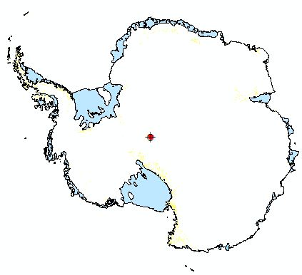 Figure 1. Antarctic vector layers.
- Add the surf_elev grid. The default is a display that
"stretches" the elevations along a continuous grayscale "Color
Ramp", showing sea level (0 m) as black and the highest elevations
as white, with the remaining 254 shades of gray representing
intermediate elevations. The way in which the intermediate
elevations are matched to one of the 254 shades of gray is given by
the "Stretch Type" which can be changed through the Layer Properties
Symbology tab. Experiment with the Stretch Type to get a feel for how the data can
be displayed differently in grayscale.
Figure 2. Antarctic surface elevation raster, displayed with default symbology.
Question 1: What is the resolution (in kilometers), data
type (integer or floating point), data depth (in bits) and number of
bands of this raster data sets? Answer this question by filling
in the chart below:
|
Raster Layer |
Resolution (km) |
Data Type |
Number of Bands |
Data Depth (bits) |
|
|
|
|
|
|
Question 2: What are the Mean, Maximum and Minimum elevations of
the Antarctic continent?
Question 3: What is the Default Stretch Type when the
surf_elev
raster is first loaded?
|
- Change the Symbology of the elevation raster to "Classified",
click the "Classify..." button in in the Symbology tab, set the
"Classification Method" to Defined Interval with an "Interval Size"
of 200 (this will group elevations by 200m intervals), as in Figure 3 below. Click OK and select a "Color Ramp" from the
Symbology tab (tip: Color Ramp names are accessible by right
clicking on the color ramp and turning off the check mark next to
the "Graphic View" option.) The Symbology tab should look like the
one shown below.
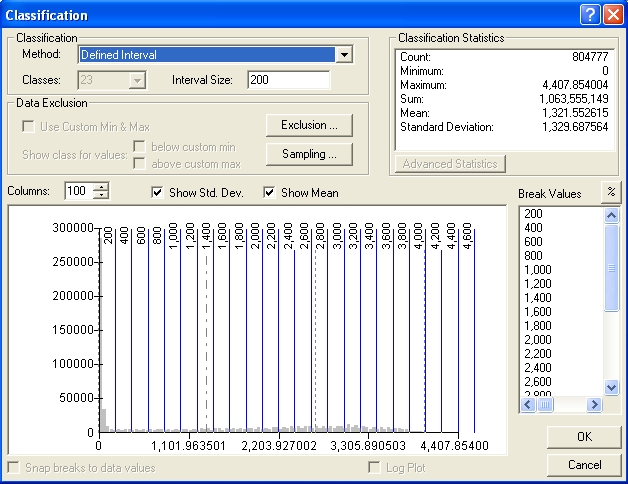
Figure 3. The classification of elevations
by 23 equal intervals of 200 meters.
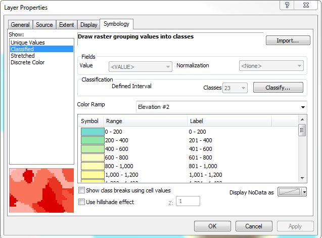
Figure 4. The symbology tab, with
elevations classified at 200 m intervals and symbolized with the
Elevation #2 color ramp. Clicking on "Label" will allow
formatting of the labels to show no decimal places, as seen in the Label
field above.
The resulting symbolized map should look like Figure 5 below.
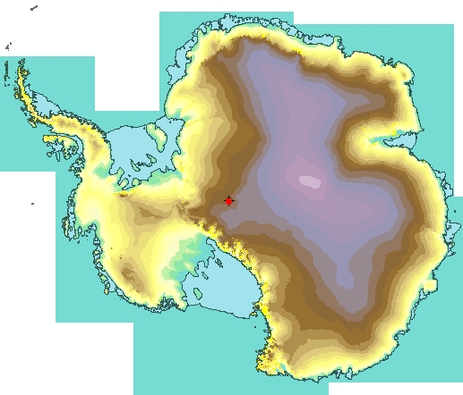
Figure 5. Antarctic elevations, classified at 200 m
intervals and symbolized with the Elevation #2 color ramp. Vector
layers overlie the elevation raster.
This is just one of many ways to display the elevation raster.
For appearance sake it would be nice to eliminate the irregular
background that
defines the boundary of the data region (the area displayed in teal
color above, at zero elevation). We could selective symbolized, by
classification, all areas of zero elevation with no color (e.g. using
the Exclusion button in the Classification window and excluding 0), but
there is a better, more permanent way!
B. Spatial Analysis - Environment Settings
- From the menu bar at the top of at ArcMap, turn on the Spatial
Analyst and 3D Analyst extensions ("Customize">"Extensions..."; check the boxes).
This step is needed to have working Spatial and 3D Analysis tools
in ArcToolbox. Even with our ArcInfo license, some of the
tools used below will not work without this initial step.
- Make a new folder in your Lab_6_data folder to store your new
elevation grids. The folder name should be less than 13 characters
long, with no spaces or special characters; e.g. use the name
"New_Grids". Spatial analyses of raster data
generally produces new raster datasets. It is very helpful to
have a special folder to store them; they are otherwise easily
corrupted and/or lost. Keep this
important step in mind for future work. This folder will become
your "working directory" for all spatial analysis in this lab.
- Open ArcToolbox from within ArcMap and expand the Spatial
Analyst Tools toolbox.
Our first analysis task, eliminating the irregular background
region from our raster, will be done with an Extraction tool:
"Extract by Mask". This will make a new raster with elevation
values only within the area of our Analysis Mask. An
Analysis Mask defines a region where an analysis will be performed -
any raster cells outside of the mask are ignored during the analysis
and, upon creation of the new raster, are given "no data" values.
The "no data" cells can be rendered "invisible" by making them
transparent. An Analysis Mask can be created from an existing
raster (see Desktop Help, analysis mask), or a vector polygon layer
can be used instead. We wish to restrict our analysis to the region
within the coastline of Antarctica, so we'll use the coast05 polygon (a.k.a.
"5M coast polygon") coverage as our mask.
One last word on Analysis Masks... all spatial analyses using
masks require that the mask have the same Spatial Reference of the
raster being analyzed. Such is the case in the procedure below,
but this is a common stumbling block for novices. Keep it in
mind for future work.
- From within the Spatial Analyst Tools toolbox expand the
"Extraction" toolbox and open the "Extract by Mask" tool.
- Click the "Environments..." button at the bottom of the window.
The "Environments..." button is available for every tool in
ArcToolbox. The options here are numerous; those listed below are particularly
useful for raster analyses:
- Expand the "Workspace" option and set it to your
"New_Grids" folder (see Fig. 6 below). This
ensures that results from your analysis will be sent
to this folder.
- The "Processing Extent" defines the area of an analysis; when performing overlay analyses (involving more than one
raster) it can be set so that results are restricted to the region where rasters overlap ("Intersection of inputs"; the default) or
to the
entire region of rasters ("Union of Inputs"). We will accept the
default Extent ("Default"), which does not restrict the analysis to
a particular region.
- The "Cell Size" option specifies the raster cell size
(resolution) of any new raster created during analysis. It is
hidden in the "Raster Analysis" option. With
analyses using two or more rasters, it is always best to set this to
"Maximum of Inputs" (the default) so that the new raster does not
have cells smaller than any of the input rasters (this is the
conservative approach; it does not require resampling of one or more
of the input rasters). Leave this set at "Maximum of
Inputs".
- A "Mask" setting is also
available in the Raster Analysis options. In
this case it is redundant because the "Extract by
Mask" tool lets us explicitly set the Mask, doing
the same thing as this option. Setting a Mask
here before doing any other kind of analysis avoids
having to first use the Extract by Mask tool and is
thus a very
useful option.
- Set the Environment settings to those shown in
Figure 6 below and explore some of the others by
expanding them and reading the Tool Help
descriptions.
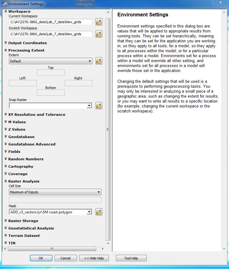
Figure 6. Environment Settings window showing
"Workspace", "Processing Extent" and "Cell Size" settings expanded and containing
entries. Note the general description on the right about Environmental
Settings.
C. Extracting by Mask - Clipping a Grid File
- Within the still open "Extract by Mask" tool, set the input raster
to surf_elev, set the mask to 5M coast polygon and
specify a name for the Output raster that is 13 characters or
less with no spaces or special characters (e.g. "surf_elev_clp")
to be saved to your New_Grids folder. Click
OK.
The result should resemble Figure 7.
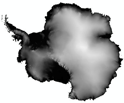
Figure 7. Result of "Extract by Mask" analysis. Compare with Figure 2.
- Once the tool finishes, the new raster file is loaded into the table of contents.
In comparison with Figure 2, note the absence of zero
values beyond the coastline; cells are still there- rasters must
always be rectangular or square, not irregular like Antarctica. These
are now "no data" cells. To see them (they are presently
transparent) go to the Symbology tab of this new layer, click the
"Display NoData as" button and select a color.
The result, when displayed as 9 equal intervals of elevation, will look something
like Figure 8.
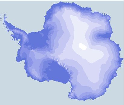
Figure 8. The new elevation raster, showing "nodata"
cells in gray and elevations classified in 9 equal intervals.
- Undo what you just did (i.e. display no data as "No
Color"), change the symbology to show a Stretched, Standard Deviations Color Ramp that is "Cyan-Light to Blue-Dark" and check
the "Invert" box to set the lightest colors to the highest
elevations. (The color ramp names - e.g. cyan-light to blue-dark
- are visible by right-clicking on the color ramp in the symbology
tab and selecting "display names".)
D. Spatial Analysis - Creating a Hillshade Raster
A "Hillshade" is a grayscale raster rendering that shows shadows and
highlights to produce a "shaded relief" map. Placing a hillshade
behind a grid that is partially transparent makes the grid look three
dimensional. To create a hillshade:
- In the Spatial Analyst Tools toolbox, expand the the "Surface"
toolbox and open the Hillshade tool. The Input raster will be your new
Surf_elev_clp raster. The other parameters in this window can be left
alone (most are self explanatory, but see the Help file on Hillshade for
details) except for the "Output raster" line.
Before clicking OK, the new raster we are about to create needs a name and location - call it
hs_clip_elev and browse to
your New_Grids folder. Now click OK.
- Move the new hs_clip_elev raster to the bottom of the Table of
Contents, symbolize it with a Stretch Type of 2 (or less) Standard
Deviations, turn it on, and make the Surf_elev_clp raster 40%
transparent.
The resulting map should now look something like Figure 9.
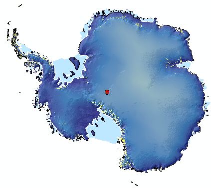
Figure 9. Antarctic topography, rendered with a blue
color ramp that is 40% transparent with a grayscale hillshade beneath.
The solid light blue areas are ice shelf/ice tongue vector polygons with white
outlines that lie on top of the other layers. Yellow similarly
shows rock outcroppings.
Question 4: The highest point in Antarctica is the
Vinson Massif (a.k.a. Mount Vinson), in the Ellsworth Mountains.
a) Using the surf _elev raster, find the cell that contains the
top of Mt. Vinson and give its latitude an longitude, in decimal
degrees. Hint: The selection tools in the Selection menu
do not work with raster data, nor is there an attribute table. Change the symbology to
highlight cells over 4300 and 4400 meters. To get locations in
decimal degrees, you can set the display units of the Data Frame in
the Date Frame Properties window.
b) Find the height of Mount Vinson on the internet. What is
it? Give a plausible reason why the known height doesn't match
the height in our DEM.
c) What is the elevation of the cell that contains the South Pole?
|
E. Spatial Analysis - Antarctic Bedrock Elevations
- Add the bedrock_elev raster. This raster shows topography
beneath the ice and bathymetry of the sea floor to 60 degrees South
latitude.
- As above, "clip" this raster by "Extract by Mask" to the
5M coast polygon
coverage. Save it with the name clip_bed_elev to your New_Grids folder.
- Create a Hillshade for this new raster, as above, and save it as
hs_bed_elev in the New Grids folder.
- Symbolize the new raster with a color ramp; the "Precipitation"
ramp, inverted, works well for bright colors. Set the display to 40%
transparent to allow the bedrock elevation hillshade created in step 3
to show through.
Your result should resemble Figure 10.
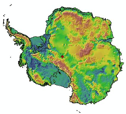
Figure 10. Antarctic sub-ice bedrock topography,
including regions beneath the permanent ice shelves. Cooler colors
are lower elevations, warmer higher. The solid black lines mark the
shoreline of the continent and edges of ice shelves/tongues. Small bright
yellow spots mark areas of outcropping rock.
Question 5: What are the mean, maximum and minimum
elevations for the continent's bedrock? Hint: View the Symbology tab in
the Layer Properties for the clip_bed_elev raster.
|
F. Spatial Analysis -
Creating a Binary Raster
What parts of the above map are below sea level, what parts above?
We can, of course, symbolize the raster to show this, but it can also be
done another way. From the clip_bed_elev raster we'll
compute a binary raster; cells with values of 1 will substitute for
cells that are below sea level, those above sea level will be give
a value of "nodata". We can then render the cells with values of 1
as blue (water) and nodata cells (land) will, by default, be transparent,
making the underlying clip_bed_elev
raster visible. To enhance the appearance of "shorelines", we can
also produce and overlay a zero elevation contour.
To produce a binary raster, we will use a Conditional Statement in
the "Raster Calculator", a very versatile tool in the Spatial Analysis
Tools>Map Algebra toolbox. See ArcMap Help (search on "Conditional
Statement") to understand the syntax and meaning of such statements. The
statement we will use is Con("grid"<=0,1), where "grid" is the
clip_bed_elev raster.
- Open the Raster Calculator and construct the expression
Con("clip_bed_elev" <= 0,1) (see Fig. 11) by a combination of
clicking on the calculator buttons and layer names. In the "Output
raster" entry area, browse to your New_Grids folder and name the
output raster binary_water. Click OK.
- Render water areas blue, make the binary raster 50% transparent, and
move it above the clip_bed_elev and hs_bed_elev rasters in the table of
contents.
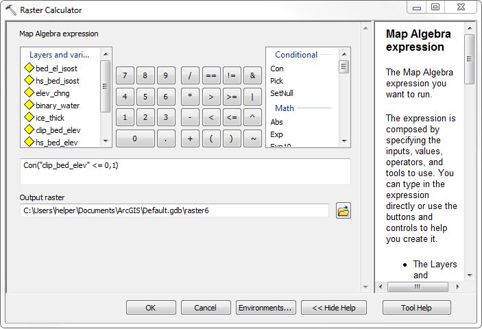
Figure 11. Raster Calculator with the conditional
statement for creating the binary water raster from
the clipped bedrock elevation raster.
Question 6: Explain, in words that include "if...
then..", the meaning of the conditional statement used to generate
the binary raster in step 1. Hint: Use ArcGIS desktop help and
search "conditional statement" for explanations of similar examples.
|
G. Spatial Analysis -
Creating a Contour Line
- In ArcToolbox, find the Spatial Analysis Tools>Surface>Contour
tool and open it. Set the "Input Raster" to
clip_bed_elev, the "Output polyline features" to the name
bed_elev_zero_contour (to be stored in your Bedrock_elev
folder), "Contour interval" to 4400 (this will produce
a single contour, because the highest elevation is 4364 m), the
"Base contour" to 0, and "Z factor" (useful when x, y
units are different from z units) to 1. Click OK.
- Symbolize the new contour line in black or dark blue with a 0.5 line width.
Order the table of contents so the contour line is visible.
Your result should resemble Figure 12.
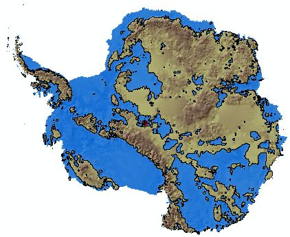
Figure 12. Antarctic sub-ice
topography, showing regions below present sea level in blue and a
"coastline" (zero-elevation) contour in black. A
suggestion of water depth is provided by the selected color ramp and hillshade raster beneath. Looks like a terrific place to go
fishing.
H. 3D Analysis - Calculating Ice Volume and Area
- Add the ice_thick raster to the Table of Contents.
This raster has 5x5 km cells that contain ice thickness values ranging from ~4500 to 0 meters.
In some ways this raster resembles
the bedrock elevation raster but these are not elevations, they are ice
thicknesses!
Question 7: Although you were provided this ice thickness
raster, you could have created one from the files you've so far
worked with. How? Give your answer in a list of steps.
Question 8: How thick is the ice at South Pole? Where
(in lat./lon. decimal degrees) is the ice thickest?
|
- If not already on, turn on the 3D Analyst extension (top
of the ArcMap window; Customize>Extensions...
check the 3D Analyst box) and display the 3D Analyst toolbar
(Tools>Customize... check the 3D Analyst box). We will not use
the 3D Analyst toolbar in this lab, though it presents several shortcuts
to tools that are also available in ArcToolbox. Just thought you
should see it and some of the tools available...
- Open ArcToolbox, go to 3D Analyst Tools>Functional Surface, and find and open
the "Surface Volume" tool.
- In the Surface volume window, set the "Input Surface"
to the ice_thick raster, the "Output Text File" to a location
and name of your choosing (e.g. ice_stats), "Reference Plane" to ABOVE,
"Plane Height" to 0, and the "Z factor"
to 1.
- Click OK.
- The tool creates a table and places it in the Table of Contents.
Right-click on the table and "Open" to view the ice area and volume
statistics.
The resulting statistics (Fig. 13) give the 2D area (plan view area),
the surface area (area of the irregular surface defined by the top of
the ice-thickness raster when the base of the ice is assumed to be
level), and the ice volume (2D area x sum of all cell values). The
units for the results are in the units of the spatial reference, in this
case meters.
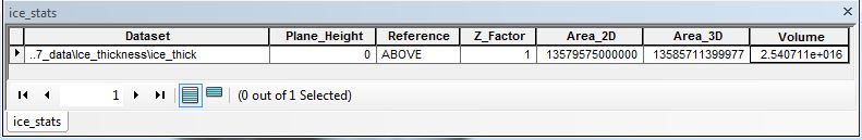
Figure 13. Results of ice area and volume calculation.
Question 9: What is the volume of the Antarctic ice
sheet and ice shelves/tongues, in cubic kilometers?
Question 10: What is the 3D surface area, in square kilometers,
of Antarctic ice?
|
I. Spatial Analysis - Antarctic Topography After Ice Removal and Isostatic Rebound
Like a ship lightened of its load, melting of the
south polar ice cap will result in the gradual rise ("rebound") of the
underlying continent. The total rise (change in elevation) can be modeled as being
directly proportional to the thickness of the ice and the ratio of the
density of the underlying mantle to that of the ice. Specifically, for
individual raster cells:
(Density of ice / Density of mantle) x (Ice thickness) = Elevation
change
Taking:
average density of ice = 0.98 g/cm3
average density of mantle = 3.34 g/cm3
- the density ratio of ice to mantle is thus about 0.2825.
To obtain an elevation raster for the continent that includes this
elevation difference, we will:
- Multiply an ice thickness raster by 0.2825 to obtain elevation
change;
- Add the resulting raster to the bedrock elevation raster to obtain
isostatically compensated elevations for the Antarctic continent.
Step A multiplies a integer raster (ice thickness) by a decimal value, resulting in a
"floating point" raster (a raster that contains decimal values in the
cells).
- Open the raster calculator and enter the
expression "ice_thick"*0.2825, specify a file name and storage location, and click
OK.
- Open the raster calculator again, load the newly calculated elevation
change raster and add to it the clip_bed_elev raster; specify a
file name (eg. bed_el_isost) and storage location, and click
OK.
- Symbolize the new bed_el_isost raster, create and save a
Hillshade, create a zero elevation contour, and make a map like Figure
14.
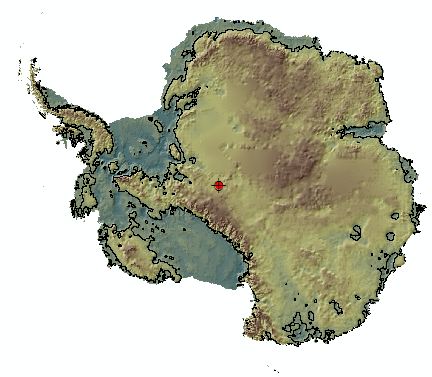
Figure 14. DEM of Antarctica without ice after isostatic rebound. Black line is present Sea Level contour.
Question 11: How do the mean, maximum and minimum
elevations for the continent after isostatic rebound differ from those of the sub-ice topography before rebound (c.f. question 5)?
|
J. Spatial Analysis - A Map of "Greenhouse Antarctica" Showing the
Effects of Isostatic Rebound and Sea Level Rise
Melting of the south polar ice cap, which contains for about 91.5% of
the ice in the world, would raise sea level by about 73 meters; melting
all of the ice on the planet would raise sea level by about 80.5 meters
(see the literature in the SL_Rise folder in the Antarctic_data folder).
To produce a map like Figure 12 that shows higher sea
level we must:
- Subtract 80.5 meters from the cells of the bed_el_isost
raster so that elevations are relative to this higher sea level
(raster calculator can do this; c.f.
section I)
- Make a hillshade of this new raster.
- Create a binary raster of regions above and below sea level
(c.f. section D).
- Create a shoreline (i.e. zero elevation) contour (c.f.
section E)
- Symbolize the results.
Your final product will resemble Figure 15.
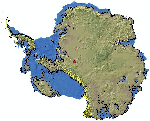
Figure 15. DEM of Antarctica after isostatic rebound
and a sea level rise of 80.5 meters. Blue areas are below sea
level. Black line is coastline/zero elevation contour relative to
a mean sea level that is 80.5 meters above the present level.
Bright yellow shows areas of present rock outcroppings; red dot is south
pole.
Question 12: The US Geological Survey has calculated volumes of ice for
Antarctica (see the "Estimated_present.doc" file in the
SL_rise
folder) that are substantially larger than those you calculated.
How much larger? Speculate on why your results are different.
|
Map to turn in: Construct a layout of your final raster.
Using a color ramp of your choosing, symbolize the final raster with
a defined interval of 500 meters. Your map should contain a
label for South Pole and an explanation that includes a color ramp
with corresponding elevations. The "Results_in_PowerPoint"
folder contains a PowerPoint of several example layouts. |
You're done!
|