|
GENERAL GUIDELINES FOR CREATING LAYOUTS IN ARCMAP
**Examine a sample
geologic map
as you read these guidelines***
1) Essential elements: A map layout should ALWAYS have all of
the following:
- Title – stating subject and location, e.g.
"Geologic Map of Paleozoic Rocks,
Streeter Ranch, Mason County, Texas"
- Scale bar; preferably in meters and with intervals that end in zeros, e.g.
50, 100, 1000, etc. An R.F. scale is also desirable (e.g. 1:12,000).
Maps of large portions of the globe, where scale is not constant,
should not contain scale bars - use lines of latitude and longitude instead. An example:
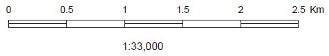
Note that the size of this scale bar is too large for all but a very big map.
- Legend (also known as an Explanation). e.g.:
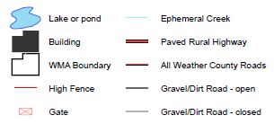
Note the symbol and font sizes - these are not from the default Legend settings,
which are invariably too large!
- North arrow ( unless lines of longitude are shown). A north
arrow is not simply a decorative icon. To be useful, it must be
long enough to unambiguously align a straight edge on the map, or precisely
orient the map to North. The
software contains may North arrow choices but only a few good ones:
 Good Good
 Poor Poor
- Your name and the date of creation (in the upper right hand
corner for our class)
- Some indication of location; a
context map, lines of latitude/longitude, or a description of the location in
the title:
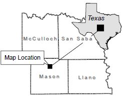
This is an elaborate example (but easily created with the software); a much
simpler version would do.
2) Space use:
Make good use of the space in the layout.
White space
is as important as content. Your layout should look well-balanced. Avoid
leaving a lot of unused space around your map, legend, etc. On the other hand,
avoid crowding. Look at the many published maps in the halls of this building for layout
ideas. Thiink about the placement of each map element:
3) Color: Avoid excessive use of bright, prominent colors. The
color scheme should attract the eye without putting a strain on it! Rule of
thumb: go with subtle colors for large areas of your layout, and save rich
colors for highlights and accents. Experiment with sets of colors to achieve
aesthetically pleasing results. Critically examine published maps in the halls
of this building
or on the web, noting the use(s) of color. Many of the ESRI symbology
defaults are quite good, particularly the color ramps. A very good source
of color advice for cartography is Cynthia
Brewer's ColorBrewer 2.0 site.
4) Bells and whistles: Use accessory graphics (decorative icons,
cartoons, photographs, drop shadows) sparingly and wisely (if at all). Make
sure the use of such items is appropriate in each case before inclusion in your
layout, and make sure that they do not shift focus away from the more important
items (i.e. the map).
5) Font: Use sans serif fonts; fonts that do NOT
have the “little feet and hats” on the letters, like the text you
are reading. A good map label font is Arial,
whereas a poor choice might be Times New Roman. Italic font should be
avoided in most cases unless the map theme calls for it (e.g. some symbol sets,
or in historical or old-world style map). You may wish to use boldface to
accentuate some text elements, particularly the title.
6) Text size: Your title should have the largest point size of all
text elements. Secondary title lines should be slightly smaller than the main
title line. Example:
Analysis of Soil Quality
Tracts 2237 and 2242, Williams
Ranch, Collin County, Texas
Other size choices will
vary depending on the purpose and style of your layout, but text should not be
smaller than 8 pt when printed. Make sure your legend text isn’t the most
prominent text on the page! Stay with the default symbol and label sizes
for the map but modify those in the Legend.
The symbol sets and label sizes generally work well at all scales if used
properly. The ESRI default text sizes for legends are generally too large,
as are "patch" sizes. Edit these to a smaller size. A
sample page-size geologic map shows
an example. An excellent discussion of font size, font color and
scale, as well as other good tips for cartographic design, is
here.
Note Well: By default, ArcMap scales
all text and symbols relative to a Data Frame "Reference Scale"; if you know you will be
printing at a particular map scale, set the reference scale to match it and your
symbols and text will be the size you specified when you created them.
Alternatively, if you don't want the symbols and text to scale, turn off
"scale map elements proportional to page size" in Print Setup, and turn off
"Scale symbols when a reference scale is set" within each layer's Properties.
7) Position: Arrange the elements of your layout so that they are
well balanced. In most cases, you will want your map centered. USE THE PRINT
PREVIEW option to check your layout before printing. Again, see an
example.
Tim Pierce, Fall 2002; Ryan Ewing, Fall 2005; M. Helper, 2008, 2011.
|
|
|