|
Messages
Syllabus
Schedule
Lecture
Lab
Projects
Trip(s)
|

 |
Lab 4: ArcMap Potpourri - Labels, Reference Scales, Annotations, Grids & Graticules,
and Selection Tools
|
|
|
|
Table of Contents
Portions of the text and data for the Labeling and Annotations parts
of this lab come from Chapter 7 of Getting to Know ArcGIS Desktop (Ormsby
et al. 2001) and have been modified by T. Pierce and M. Helper.
Click here to download a list of
the questions and maps to be turn in for this lab.
4.I Labels in ArcMap
Broadly speaking, a label is any text that names or describes a feature
on a map, including proper names (Thailand, Trafalgar Square, Highway 30),
generic names (Tundra, Hospital), descriptions (Residential, Hazardous),
or numbers (7,000 placed on a mountain to indicate its elevation). In
ArcMap, labels specifically represent values in a layer attribute table.
You can type other bits of text onto a map, but, strictly speaking, they
are not labels. ArcMap has pre-built "Label Styles" for countries, cities,
streets, and other common features. You can use these or choose you own
fonts, sizes, and colors.
4.11 Dynamic Labeling
You can label all features in a layer at once and have ArcMap adjust
the label placement as you work with the map. This is called dynamic
labeling. You can set guidelines, but ArcMap chooses the exact label
positions and changes them as you zoom, pan, or label additional layers.
By default, ArcMap displays as many labels as it can without causing
overlaps. Because overlaps are not allowed, labels that appear at one
scale don’t always appear at another. Dynamic labels cannot be selected or
individually modified.
*** As a default, ArcMap does not allow dynamic labels to
overlap. This means that, depending upon the scale and the part of the map
you are looking at, some features in a layer may not be labeled. If you
want to be sure that every feature in a layer is labeled, you can change
the default to allow overlapping labels. You can also control whether
labels in one layers can overlap labels or features in other layers.
Read more about this in the ArcGIS Desktop Help by using the Index and the
words "dynamic labels" and then "controlling the appearance of.. ***
- From your Lab_4_data folder on your Y drive, open the map file
Labeling.mxd. You should see a map of Mexico and Central America.
Save the file as My_labeling.mxd on your Y drive. Ensure that
your data source options are set to store relative path names.
- Click on View>Bookmarks>Southeastern States. This will take you to a
zoomed in view of the southeastern states of Mexico.
- In the
Table of Contents, right-click the Southeastern States layer and click
Label Features.
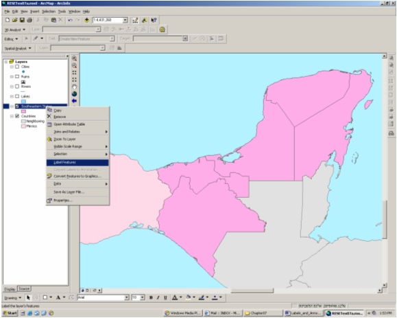
Each feature (state polygon) in the layer is labeled with its name,
which is an attribute (in this case the ADMIN_NAME field) contained in the
Southeastern State layer’s attribute table.
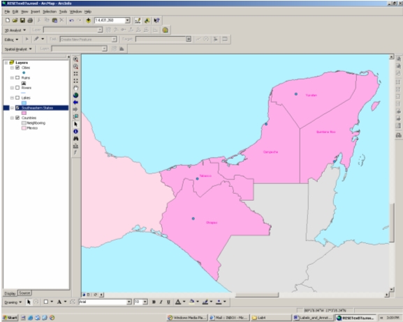
This is a very POWERFUL tool—imagine how quickly you could label
hundreds of features using the dynamic labeling technique versus typing
each text string by hand! Once dynamic labels are in place, you can
modify them using the Labels tab in the Layer Properties. Note that
modifications are applied to all of the layer’s dynamic labels that belong
to the default "Label Class" (more on this below). You cannot modify
individual dynamic labels, but can construct your own Label Classes and
assign different labeling behaviors to each class, as well see below.
- Explore the options available on the Labels tab—you will need them
later.
4.12 Reference Scales
The size of all labels, symbols, annotations, etc. is set and accessed
through the now very familiar symbol selector window. Line widths,
point symbol sizes, and font size are all set within this environment.
The size of these features is usually specified as a point size, e.g. "10
pt" text for a label corresponds to 10 point type (100 point text is 1
inch high). To have text and symbols that get larger and smaller as the
map scale changes, there must be reference scale. Without a
reference scale, text and symbols will always remain the same size,
regardless of the scale at which they are displayed or printed. A
reference scale scale can be set for individual groups of labels
(discussed below) and/or for the Data Frame.
A reference scale for the Data Frame is established by:
1) typing in a scale in the Data Frame Properties>General tab, or;
2) right-clicking the Data Frame in the TOC and "Set Reference Scale".
This will set the reference scale to the current scale of the display.
The same technique permits the useful options "Clear Reference Scale" and
"Zoom to Reference Scale".
Get in the habit of setting a Reference Scale for all of your maps.
It is the only way to precisely control the relative size of
symbols and labels, short of manually adjusting them every time the map
scale changes (you never want to do that!). When labels or symbols
get too big or small in the display, the reference scale can easily be
changed by method 2 above.
- Set the Reference Scale for this map to 1:6,500,000, a scale
appropriate for the display of the 11 point state labels at the scale of
the bookmarked view.
- Note the change in label size as you zoom in and out, and as you
reset the reference scale. The labels are 11 points in height only
at the reference scale.
4.13 Interactive
Labeling
Feature labeling can also be done one feature at a time in positions that
you choose. This is called interactive labeling. This is the
labeling process we used in Lab 2. The placement options of
interactive labels can be chosen by ArcMap or by you. Once placed, these
labels can be selected, moved, and individually modified. ArcMap will not
prevent overlaps or otherwise manage them.
- Turn on the display for the Cities Layer.
-
Access the Label button in the Draw toolbar. The Label
button has a picture of a white desktop mouse on it and shares the same
space as the Text button.
 To
access the Label button, click the black triangle on the Text button, and
click on the Label icon. To
access the Label button, click the black triangle on the Text button, and
click on the Label icon.
- When the Label button is depressed, a Labeling Options window
appears. With this window you specify label placement and style of the
interactive labels. For now, accept the default options, and close the
Labeling Options window.
- Put the pointer over the city in the state of Yucatan, and click.
The interactive label Merida should appear—this is the name of the city,
which is an attribute in the City layer’s attribute table. If you miss
the city and accidentally click on the state polygon, you will see a
Yucatan label appear. Just highlight this label and press the Delete key
on your keyboard. Then try to label the city again.
- Use the same procedure to label the city in the state of Tabasco. As
you will see, the default options place the city name on top of the
state name. Because this is an interactive label, you can move
it.
- Move the cursor over the label so that a four-way arrow appears.
Click-and-drag the label so that both labels are legible.
- To change the properties of an interactive label, double-click the
label using the Select Elements tool (black arrow) in the Draw toolbar.
The "Change Symbol…" button in the Properties window will give you
access to the properties you wish to modify in most cases. Explore the
options for changing properties—you will need them later.
As you can see, interactive labeling is useful if you want to label
only a few features in a layer, especially if you plan to customize the
appearance of individual layers.
4.14 The Text Tool
You can also add text to a map using the Text tool
 in the Draw
toolbar. It shares the same spot as the Label tool. Just click the Text
tool, click on the map where you wish to place text, and type the text.
You can alter the properties of text elements the same way you alter
properties of interactive labels. in the Draw
toolbar. It shares the same spot as the Label tool. Just click the Text
tool, click on the map where you wish to place text, and type the text.
You can alter the properties of text elements the same way you alter
properties of interactive labels.
Text elements created using the text tool ARE NOT considered labels in
the context of ArcMap because they do not directly reference information
in a layer’s attribute table, nor do they scale with respect to the
reference scale. The letters you see are defined solely by your
keystrokes, and the font sizes you set.
IMPORTANT! Note that Text tool elements created in Layout view will not
appear in Data view. Text tool elements created in Data view, however,
WILL appear in Layout view. This same pattern is also applicable to all
other elements added to the map using the Draw toolbar.
- Experiment with the Text tool in your map file. Explore the
properties of text elements.
- Save your map file.
|
|
|
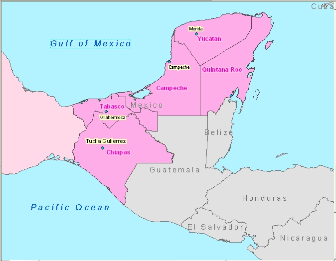
4.14 Map to turn in:
Save a copy of your map file and rename it. Using this renamed file,
produce a screen capture at a scale of 1:6,500,000 as close in appearance
as possible to the one shown below. Note the adjustments to symbology as
well as the addition of labels and text.
|
|
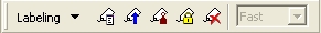
4.15 Dynamic Labeling -
Labeling Strike/Dip Symbols using Label Classes
A feature new to Arc Info 9.0 is the Label Manager, a collection of all
of the tools and labeling features described above (plus some others),
collected in a single interface. The Label Manager is part of the Labeling
Toolbar.
- From your Lab_4_data folder on your Y drive, open the map file
Strike_Dip_Labels.mxd. After ensuring
that your Data Source Options are set to store relative path names, save
the map as My_Strike_Dip_Labels.mxd in the same folder.
- Open the Labeling Toolbar
 from the
Tools menu> Customize..., or simply
by right-clicking in the menu area of the ArcMap window and selecting
it.
from the
Tools menu> Customize..., or simply
by right-clicking in the menu area of the ArcMap window and selecting
it.
- In the class folder, find the Digital Book (PDF file) “Using ArcMap”
and open it to Section 2, Chapter 7, page 241. Read pages 241-246.
To explore some of features of the Label Manager, we will tackle a
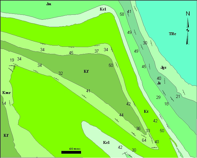
common geological map-making task, labeling strike/dip symbols. A
strike/dip symbol shows the measured orientation of a planar feature and
is always labeled with the measured dip (i.e. the angle that the plane is
inclined to the horizontal). Properly labeled strike/dip symbols look like
those in the geologic map below, with a label adjacent to the small
dip tic mark of the symbol. Furthermore, symbols are always plotted
so that the long line of the symbol is parallel to the measured strike of
the plane. Most of you will recall the definition of strike: the
bearing of an imaginary horizontal line on a plane.
For those unfamiliar with the concept, look
here.
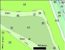
Portion of a geologic map, with properly
labeled strike/dip symbols.
Strike and dip measurements are point features. As such, the
actual measurements are contained in an attribute table, with fields for
Strike azimuth and Dip angle, as shown below. The strike/dip
symbol is a point symbol that is available in the "Geology 24K" ArcMap
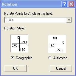
symbol set. Strike/dip symbols are rotated by the amount given in
the "Strike" field of the attribute table, using the Rotation option (see
figure below) in the Layer Properties>Symbology
tab.
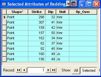
Attribute table for strike and dip layer in the
map Rotation window for point feature
classes.
above. Strike azimuths obey the right hand rule.
The obvious thing to do is to use the Dip field of the attribute table
to produce dynamic labels for the strike/dip symbols, but the job is
complicated because dip labels must always be adjacent to the dip tic mark
of the symbol (see the map above). There are potentially 8 possible label
positions around a symbol: to the N, NE, E, SE, S, SW, W, and N of the
symbol. How do we make the software choose the right one for each
plotted symbol?
One way is to construct eight separate Label Classes (you just read
about these in the PDF, remember?), one for each possible label position.
Strikes with azimuths within a certain range will be used to define each
Label Class, and each separate Label Class can be given a different label
position. The relationship between label position and azimuth is fixed by
the so-called Right Hand Rule. All measurements in the attribute
table for this exercise obey this convention, which states that the dip
direction (the side of the symbol where we want the label) is always to
the right of, or clockwise from, the strike azimuth. With this in
mind, what is the range of strikes we need for each of the eight Label
Classes?
Let's look at a few examples from the map and table above. For a
strike of 298, we want a label on the NE side of the symbol; on the map
above, this has the label "32". For a strike of 157, the label
should be on the SW side of the symbol; a label of "50" is shown on the
map. For all possible strike azimuths, consider the following
diagram:
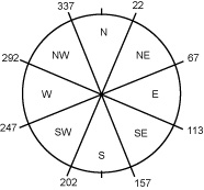
The azimuths in the diagram define 8 labeling
quadrants. Strike azimuths that fall between 247 and 292 should receive
labels on the N side of the strike and dip symbol, those between 293 and
337 get labels to the NE of the symbol, etc. The 8 Label Classes can
thus be defined by strike azimuths as:
- 247 > N < 292 (i.e. an azimuth between 247
and 292, inclusive, gets a dip label on the N side)
- 293 > NE < 337
- 338 > E < 22
- 23 > SE < 67
- 68 > S < 113
- 114 > SW < 157
- 158 > W < 202
- 203 > NW < 246
OK..., with the strategy out of the way, let's make the Label Classes.
Before we do, let's change the Bedding Measurements symbol from the
default dot to a strike and dip symbol, then rotate the symbols to their
proper orientation.
- Open the Layer Properties>Symbology tab for the Bedding Measurements
layer.
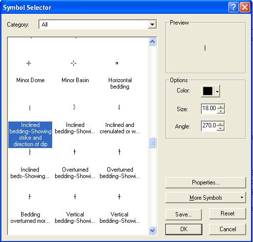
- Click on the dot symbol button to open the Symbol Selector window.
- The default ESRI point symbols are shown, but no geological point
symbols. To load them, click the "More Symbols" button and
select the "Geology 24" from the list. Geology point symbols are
now loaded into the Symbol Selector and can be selected by scrolling
down.
- Select the "Inclined beds-Showing strke and direction of dip" symbol
(see below) and click OK.
-
In the Layer Properties>Symbology tab, click the
"Advanced" button, select "Rotation...", set the "Rotate Point by Angle
field" to Strike and set the "Rotation Style" to Geographic, if it's not
already selected (see one of the figures above).
-
Click OK twice and you should see oriented strike and dip
symbols that closely resemble those in the map above,
without, of course, the dip labels.
It's time for dip labels...
-
From the Label Manager Toolbar, open the Label Manager
Dialog
 . .
-
In the Label Manager table of contents area on the left,
highlight the Bedding Measurement layer. Doing so brings brings up
form fields for "Add label class" and "Add Label classes from symbology
categories"
-
Type in North_dip in the "Enter class name:" box and click
the "Add" button.
-
Do it again 7 more times with class names Northeast_dip, East_dip, Southeast_dip, etc. that correspond to the Label
Classes we'll need. Each class name shows
up in the table of contents area below the "Default" class for the Bedding
Measurements layer after it is added.
-
If you make a mistake and need to remove a Label Class,
click OK to close the Label Manager, then open the Layer Properties>Labels tab
for the Bedding Measurement layer, change the "Method:" field to "Define
classes of features and label each class differently", select the class
you want to delete from the "Class:" drop-down menu, and click the
"Delete" button.
After all 8 Label Classes have been added, we need to
specify the label positions and range of azimuths for each class.
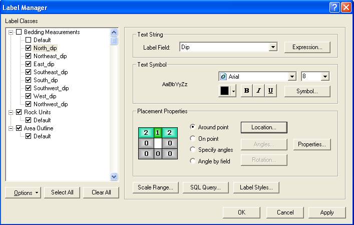
-
In the "Text String" area, from the drop down list set the
Label Field to "Dip". This specifies that the labels will come
from the dip field of the Bedding Measurements attribute table.
-
From the "Placement Properties" part of the Window, select
the "Around point" radio button (if not already selected), then click the
"Location..." button and select, from the many choices, the "Top Only,
Prefer Center" placement. This sets the highest priority for label
placement to the N of the symbol, secondarily allowing the label to be
placed to the NE or NW if there is not room to the N. The graphic
illustrating this placement is shown in the figure above, in the
"Placement Properties" part of the window.
-
To specify the range of strike azimuths for this Label
Class, click the "SQL Query..." button to bring up the Structured Query
Language query window, shown below. We will construct an expression
in the lower half of the window that uses the "Strike" field of the
attribute table. The expression
needed is shown below.
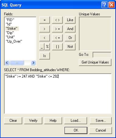
-
To construct this expression, Double click "Strike", type
in 247, click the ">=" button, click the "AND" button, double click the
"Strike" entry again, click the "<=" button and type in 292. Spelled
out, this expression reads "Select from the Bedding_attitudes layer those
entries in the attribute table where "Strike" is greater than or equal to
247 and less than or equal to 292". This selection defines the range
of strike azimuths for the North_dip Label Class.
-
Repeat the above three steps for each of the remaining 7
Label Classes, using the strike azimuth ranges
given earlier. Click OK occasionally to close the Label Manager
and save your work.
-
If not already done, turn off the "Default" label class
for Bedding Measurements and turn on the 8 Label classes you have created.
Turn on labeling for this layer. Click OK to close the Label Manager. You should now have a map with
the strike and dip symbol appropriately labeled.
-
Save your map document.
|
|
4.15 Map to turn in:
Paste a screen capture of the above map into your answer sheet.
Before doing so: 1) "Zoom To Layer" to the Area Outline layer; 2) Set the
Reference Scale for the Data Frame to 1:24,000. Nothing fancy is
required, just a map showing that you have completed the Label Classes
example above. An example is below.
|
|
|
4.16 Labeling Review
3 ways to add text to a map:
1) Dynamic Labeling
2) Interactive Labeling
3) Text Tool
Labels vs. Text elements:
- Labels reference information in a layer’s attribute table, whereas
text elements are simply text the user types in manually.
Dynamic Labeling vs. Interactive Labeling:
- Dynamic labeling labels all (or nearly all if overlapping must be
avoided) features in a Label Class at once. These labels cannot be
selected or individually modified. A default Label Class
exists for all layers. Other Label Classes can be constructed to allow
different labeling behaviors within a layer.
- Interactive labeling labels individual features in a layer in a
location chosen by the user. Interactive labels can be selected
and individually modified.
|
|
|
Question 4.11: When setting labeling priority, will the layer at the top
of the list or the layer at the bottom of the list be labeled first?
Question 4.12: True or False. When setting conflict detection rules, a
label with a higher weight can be overlapped by a label with a lower
weight.
|
|
|
|
|
|
In ArcMap, any interactive labels or any graphics manually added to the
map using the Draw toolbar while in Data View are
annotation. Dynamic labels are NOT treated as annotation.
Annotation items can be selected, moved, or modified individually. They
can also be manipulated as a group. An annotation group is a group
of graphics and/or interactive labels that share common properties. These
properties include scaling constraints and reference to a specific layer
in the data frame.
Every data frame has a default annotation group called <Default>.
- Close your map file from the previous
exercise, open My_labeling.mxd and save it under a new name so you can manipulate it for
this exercise. Click on the "Annotation Groups" tab in the Data Frame
Properties window. You will see the <Default> annotation group listed.
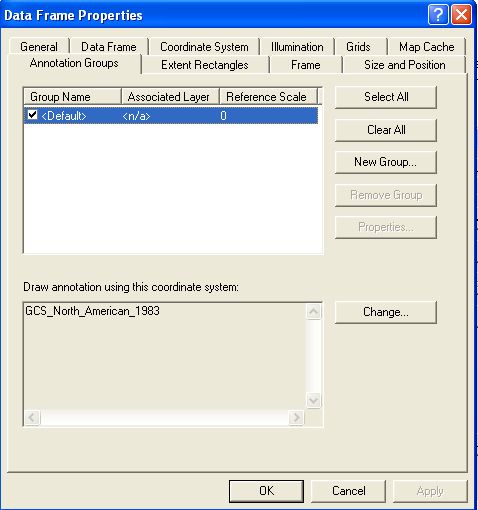
Every graphic or interactive label that is created is automatically
assigned to the default annotation group. The check box to the left
displays or hides items in the annotation group.
4.21 Creating and Targeting Annotation Groups
You can easily create other annotation groups. Just click the "New Group..."
button on the Annotation Groups tab in the Data Frame Properties window.
Name your new group and click OK. You will see the new annotation group
listed below the default annotation group. To adjust the properties of
this annotation group, click the Properties button while the annotation
group name is highlighted in the list. Here you can change the name of the
group, assign the group to a specific layer, set a Reference Scale for the
group and constrain its scale range.
To assign annotation to a specific annotation group, it is easiest if
you assign BEFORE creating the annotation. Click on the black triangle
next to Drawing
 in the Draw
toolbar, choose Active Annotation Target, and click the annotation group
to which you want to assign annotation. After doing this, any annotation
you create will be assigned to the group you targeted until you change the
target. in the Draw
toolbar, choose Active Annotation Target, and click the annotation group
to which you want to assign annotation. After doing this, any annotation
you create will be assigned to the group you targeted until you change the
target.
Implementing multiple annotation groups is useful if you want to format
sets of labels and graphics differently.
- Create a new annotation group, target it, and create some new text
and drawing graphics that will be assigned to the new group. Experiment
with the properties of your new annotation group. Save and close your
map file when you are finished.
|
|
Question 4.21: True or False. If you have only one annotation group (i.e.
<Default>), turning it off will hide all dynamic labels, interactive
labels, and Data View graphics. Explain.
Question 4.22: If you assign an annotation group to a specific layer, will
the annotation disappear if you turn off the display for that layer?
Question 4.23: True or False. If you assign an annotation group to a
specific layer and later delete that layer, the assigned annotation will
also be deleted.
|
|
|
|
|
|
4.22 Converting Dynamic Labels to Annotation You can combine the advantages of dynamic and interactive labeling by
converting dynamic labels to annotation. To learn this technique, we will
use the same data as used in the Labels exercise, but the data is arranged
differently in a different map file. Go to your Lab_4_data folder on your
Y drive, and open the map file Annotations.mxd. Save a copy of the file as
MY_annotations.mxd on your Y drive so you can make changes while maintaining
the original file.
On the map you will see ruin locations with labels, state labels, and
cities. Only the city of Mérida, the largest peninsular city, is labeled.
Note how some of the state labels are too close to cities or ruins.
Currently, the state labels are dynamic labels, so you can’t modify them
individually. You’ll convert them to annotation so that you can move the
problem labels.
- In the Table of Contents, right-click the Southeastern States layer
and click Convert Labels to Annotation. The Convert Labels to Annotation
dialog opens.
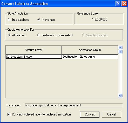
- In the Annotation storage options frame, the option is set to store
the annotation in the map rather than as a geodatabase feature class.
(You’ll learn how to save annotation in a database later in this
lab.) This means that the dynamic labels will be converted to text
graphics and saved in the map document. Other settings affect whether all
or only some of the labels are converted and how overlapping labels are
managed. Note that the Reference Scale is the same as that set for the
Data Frame, 1:6,500,000. This is very important. Before
converting Labels to Annotations you should carefully consider the scale
at which you will eventually want the labels to print and display, i.e.
the reference scale, and make sure it is set properly in the Data Frame
before converting to annotations. It can, however, be changed if
need be.
- Accept the defaults and click OK.
The labels are converted to annotations that are assigned to a new annotation
group—Southeastern States Anno. To confirm this, go to the Annotation
Groups tab in the Data Frame Properties window. Highlight the new group,
and click on Properties. Note that by default, the new annotation group is
referenced to the layer from which the annotation was derived
(Southeastern States). Close the Properties windows.
- The positions of the labels may have changed slightly when converting
them to annotation. Note that we still have a problem with the placement
of the text—the text elements Yucatán, Tabasco, and Chiapas are a bit too
close to ruins or cities. Move these text elements individually, using the
graphic below as a guide.
- Remember to refresh the data view if the display doesn’t fully reflect
the changes you apply.
|
|
|
Question 4.24: True or False. Because ArcMap by default assigns the source
layer as the reference layer for converted annotation, there is no way to
“untie” the annotation from that layer—i.e. the resulting annotation
displays only when the source layer displays. Explain.
Question 4.25: Imagine that the ultimate result of a GIS project you’re
working on will be a printed map at a scale of 1:12,000. You need to label
all the geologic units in your Geology layer, 225 out of 230 wells in your
Wells layer, and 3 out of 50 faults in your Faults layer. The labels are
stored in an attribute table field called "label" for each of the layers. Explain an
efficient strategy for labeling each of your layers. Be specific.
Question 4.26: For the map in Question 4.25, you find it is easier to work
with your Well labels at a scale of 1:10,000 (the wells are spaced more
widely at this larger R.F. scale). You also discover that the labels
become cluttered at a scale of 1:24,000 (the wells appear closer together
at this smaller R.F. scale). Explain how to control the well labels’
appearance so that you can easily work with them and they don’t cause map
clutter. Be specific, and be sure to keep in mind your target print scale
of 1:12,000.
|
|
|
|
|
|
4.22 Saving Annotation as a Feature Class
Annotation can also be saved as a feature class in a geodatabase.
Suppose that you have carefully labeled a feature class (e.g. the Ruins
feature class from the previous exercise). Converting the labels to
annotation and saving the annotation as a feature class will allow you to
add the same labels to any map that contains the Ruins layer.
- Save and rename a copy of the map file used in the "Converting
Dynamic Labels to Annotations" exercise. We will use this file to
convert the Ruins labels to a feature class.
- Open ArcCatalog, and create a new personal geodatabase in a location
of your choice on your Y drive. Name it labels_to_anno.
- In ArcMap, right-click the Ruins layer, and select Convert Labels to
Annotation…
- In the Annotation storage options frame, select “In a database”, if
not already selected.
Click the yellow folder button. In the window that opens, navigate to the geodatabase you created. Click
Save.
- In the Create Annotation Feature Class window, Click Convert.
- The new feature class will automatically be added to your open ArcMap
document. Turn on the new feature class and turn off the Ruins layer.
Refresh if necessary. This demonstrates that the text is now separate
from the Ruins layer. Do a screen capture of this scenario, and paste it
in the appropriate place in your answer sheet.
|
|
|
4.27 Screen capture to turn in: Paste in your screen capture from the Saving
Annotation as a Feature Class exercise.
|
|
|
|
|
|
For more information on labels and annotation, in the ArcGIS Desktop
Help Menu see:
ArcMap > Labeling maps with text and graphics > About labeling
ArcMap > Labeling maps with text and graphics >Organizing annotation
into groups
Geodatabases > Managing annotation
|
|
|
|
|
|
Grids and graticules are networks of intersecting lines used to mark
intervals in coordinates systems. A graticule is a network of medians and
parallels. Graticule lines correspond to degrees of latitude and
longitude. In an unprojected view, a graticule appears as straight,
perpendicular lines. In a projected view, a graticule appears as curved
lines. A grid is a network of evenly spaced, perpendicular lines used in a
projected coordinated system. Grid lines correspond to linear distances of
eastings and northings. A grid is only meaningful for data that are
projected, and grid lines produce a network of squares or rectangles.
4.31 Creating a Graticule
We will use a map of Texas showing zip code regions for this exercise.
Note that the options and settings used in this procedure will work for
most data you use in this class. You may wish to experiment with different
options and settings for later projects depending on the purpose of the
specific project, target audience, and personal preference. The key is to
have a graticule that is easy to read and has an appropriate scale.
Note now: Do not attempt to construct a map legend showing Texas zip
codes. The huge number of zip codes will choke the layout and
crash or lock-up the program.
- Open the Graticule_exercise.mxd file from your Lab_4_data
folder on your Y drive. You should see an unprojected view of Texas
showing zip code regions.
- Set the Data Frame to display Texas in a Lambert Conformal Conic
projection - consult Lab 2 if needed.
- While in Data Frame Properties, click on the Grids tab.
- Click New Grid.
- Select Graticule: divides map by meridians and parallels, and change
the name to Texas Zip Codes Graticule.
- Click Next.
- Choose Graticule and labels in the Appearance frame and keep the
default Style.
- In the Intervals frame, type 1 in the degrees cell for both the
latitude and longitude. A 1 degree interval is appropriate for the scale
of Texas. The appropriate interval will vary for other data sets and
will have to be determined for each case.
- Click Next.
- Accept the default Axes and Labeling parameters.
- Click Next.
- Select Place a simple border at edge of graticule.
- Select Store as a fixed grid that updates with changes to the data
frame, the default. THIS IS A VERY IMPORTANT STEP! Choosing the default will enable
your graticule to change as you pan and zoom your data. Do not choose
the static graphic option unless you are certain you will
not further change the data’s scale or position in your layout.
- Click Finish, then OK.
- Go to the Layout View to view your graticule (even when turned on,
neither grids or graticules are visible in Data View). Using the Zoom In
tool on the Layout toolbar, zoom in to a corner of the graticule. You
will likely see that your graticule intervals are 1 degree, just as you
specified. Each interval may not be labeled, however, to avoid crowding
of the text. You can adjust the size and orientation of the axis labels,
along with many other properties of the graticule, by going to the Grids
tab in the Data Frame Properties window, highlighting the graticule of
interest, and clicking the Properties button.
|
|
|
|
|
|
4.32 Creating a Grid
We will download a digital orthophotograph (DOQ) and digital raster graph
(DRG) of
an area in Big Bend National Park in Brewster County, Texas for this
exercise. Note
that the grid options and settings used in this procedure will work for most
data you use in this class. You may wish to experiment with different
options and settings for later projects depending on the purpose of the
specific project, target audience, and personal preference. The key is
to have a grid that is easy to read and has an appropriate scale.
The data, and similar data for the entire state, can be found
here.
- Open the "Data Search/Download Help" link at the above link to
learn how how to obtain
data at the TNRIS website. Before downloading any data, create
two new folders in the Lab4 folder of your Y drive. Name one
CastolonSW_DOQ, the other Castolon_DRG.
- Download the 24K Castolon DRG into its folder and do the same for the
DOQ for SW quarter of this 7.5' quadrangle (use the 2004 NAIP 1 m link -
this is the most recent photo available for the area).
- The downloaded files are zipped (compressed). They comprise several
individual files that need to be unzipped and stored back into the
folders that contain the zipped data. Browse to the folder
containing the DRG zipped file, double click on the file and select
"Extract all files" from the Folder Tasks menu on the left side of the
Windows Explorer window. Extract it into the same folder containing the zipped
version. Ask Tiffany for help if you haven't done this before.
- Do the same for the DOQ.
- Note that the unzipped DOQ is a MrSID (raster) image,
and that it is accompanied by a world file (extension .sdw), a metadata
file (.xml) and an ArcGIS-readable georeferencing file (extension .aux).
As stated in the metadata, the DOQ is georeferenced with respect to
NAD83, UTM zone 13.
- Note also that the DRG is in tif format, has an accompanying world file
(.tfw) and comes with a .txt file, which is a text file containing the
metadata. A .tif.xml file is also included, which contains the
metadata for the DRG in a format that is directly readably by ArcCatalog!
An .aux files contains the spatial reference information for the file,
again directly readable by ArcGIS.
- Open ArcCatalog, browse to the DRG and DOQ files, preview them, and
confirm that the spatial reference for each is defined (see lab 2 if
you've forgotten how to do this).
- Open a new map in ArcMap, load the DOQ first, then the DRG.
- If it's not already there, place the the DRG layer on top of the DOQ
layer.
- Set the Data Frame reference scale to 1:12,000 and rename each of the layers so
that you can tell them apart.
- Explore the two images. Find Santa Elena Canyon on the Rio
Grande, and the park road leading to it. You will make 1:12,000
maps with UTM grids of the mouth of the canyon and the area area around
it.
- Switch to Layout View, go to Page Setup and change the page
orientation to Landscape.
- Pull out the Data Frame in the Layout View so that it encompasses
most of the page, but leave enough room at the edges for the grid labels
and some text.
- In the Data Frame Properties window, click on the Grids tab.
- Click New Grid.
- Select "Measured Grid: divides map into a grid of map units", and
change the name to BBNP 100m Grid.
- Click Next.
- Choose Grid and labels in the Appearance frame.
- Keep the default Style.
- In the Intervals frame, type 100 for both the X and Y values. A 100
m interval is appropriate for a 1:12000 scale. An appropriate
interval depends on the scale that the map will be viewed or printed and will vary for other data sets.
- Click Next.
- Accept the default Axes and Labeling parameters.
- Click Next.
- Select "Place a border between grids and axis labels".
- Select "Store as a fixed grid that updates with changes to the data
frame". THIS IS A VERY IMPORTANT STEP! Choosing this option will enable
your grid to change as you pan and zoom your data. Do not choose the
static graphic option unless you are certain you will not further change
the data’s scale or position in your layout.
- Click Finish, then OK.
- View your grid in Layout view. Using the Zoom In tool on the
Layout toolbar, zoom in to a corner of the image. You will likely see that
your grid intervals do not fall on numbers ending in zero and that several
decimal place values are shown. This is the default format that ArcMap
uses for some unexplained reason. You will want to change it as it is not
very practical.
4.33 Editing Grid Intervals
- Zoom back out to the Layout’s full extent.
- Go to the Grids tab in the Data Frame Properties window.
- Highlight the grid you just created, and click the Properties button.
- Go to the Labels tab, and click on Additional Properties…
- Click on Number Format…
- Change the number of decimal places to zero in the Rounding frame.
- Keep clicking OK until you are out of the properties windows.
- You should see that the decimal places are gone. (You may have to
refresh.) Now let’s shift the grid interval so that the values end in 00
to better illustrate the 100 m interval we have chosen.
- Go back into the grid’s properties, and click on the Intervals tab.
- Here, you must input an origin value that falls within the area shown
in the layout. Select Define your own origin, and use 629500 for X and
3226300 for Y. For other data sets, you will need to find an appropriate
origin, though the software will seemingly take nearly any value within
reason. Keep clicking OK until you are out of the properties windows.
- You should now have a 100 m grid whose intervals end in 00.
- Save your map file.
|
|
|
4.32 Maps to turn in: Create a layout of the Santa Elena Canyon
region of Big Bend National Park with a 100 meter UTM grid. You
may need to resize the data frame to have room to add essential layout
elements to the map collar. You may also need to use the pan tool on the
Tools toolbar to center the map in the frame. Note how the grid automatically
updates as you adjust the size and relative geographic position of the
data frame. Pretty cool! In addition to elements we’ve added before, you
should also add small font text to the map collar that gives the
coordinate system and datum for the grid (NAD83, UTM Coordinates, Zone
13N) and the grid interval (100 m). Print and turn in a page size
map at 1:12,000 of either the DOQ or DRG.
|
|
|
|
|
|
|
|
|
For a variety of reasons, including overlay
analysis, extraction of data to make new files, clipping, merging,
unioning and other operations, there is often a need to select subsets of
layers within a GIS. A variety of tools are available to do so;
indeed this is one of the principle traditional strengths of GIS.
The four techniques described below involve selection: 1) from within an
attribute table;
2) by attributes; 3) by location; and 4) interactively from the display .
4.41 Selection from an attribute table
All vector data are tied to attribute tables. One of the simplest
methods of selecting features within a layer is to simply select the
appropriate records in the layer's attribute table.
- Open BigBend_NP.mxd from your lab4 folder on your Y drive. The
map document is a GIS of the geology of Big Bend National Park that also
shows roads, streams, the park boundary and Texas counties. The
symbology for these layers is stored in layer files (.lyr) that are
visible in ArcCatalog within the Lab_4_data>Data_Files>Big_Bend_NP
folder
- Open the attribute table for Geological Units layer (right-click,
Open Attribute Table).
I'm working on a map of Tertiary intrusive rocks in the SW US and want
to extract the Intrusive rock polygons from the Big Bend NP geological map to
incorporate with other data. To do so, they need to be selected,
then exported as a new shapefile or geodatabase feature class. The
geological units attribute table contains a field for FORMATION, with
attributes of formation name, from which I want to select those polygons
that have the name "Intrusive rock".
- Sort the FORMATION field by right-clicking on the field heading and
selecting "Sort Ascending..."
- Beginning with the first Intrusive rock polygon listed (FID is 55
for this record) and with the Shift key pressed, drag the mouse downward
over the all of the Intrusive rock records, highlighting them as you go.
When you finish, you should have highlighted 490 records.
- Reduce or collapse the Attribute table window and look at the map.
The intrusive rocks should now be selected and shown with an outline of
light blue.
- To export these polygons and their attributes, right-click on the
Geologic Units layer name in the TOC, choose Data>Export Data. An
Export Data dialog opens. You want to export "Selected Features"
using the same coordinate system as the layer's source (though this
could be changed to match any existing data) and you will store the
new shapefile in your lab4 folder within the Big_Bend_NP folder.
After setting these parameters, give the file a name and Click OK to export the data and create a
new shapefile.
|
|
Question 4.41 What is the coordinate system of the Geological Units, Big
Bend NP layer? What is the coordinate system of the Big Bend NP Data
Frame? |
|
|
|
|
4.42 Selecting by attributes
The above technique is tedious and impractical for all but the smallest
datasets. A much better method relies on constructing a selection
query in SQL, short for Structured Query Language.
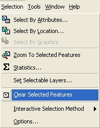
- Clear the previous selection by going to the Selection menu
at the top of the window and choosing "Clear Selected Features"
(see adjacent graphic).
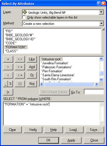
- From the same menu "Select by Attribute..." to bring up the
Select by Attribute dialog window (see graphic below). In this window you can
construct simple or complex queries of the attribute tables of
any of the layers of the map. The point and click interface for Fields and
Unique sample values greatly simplify the process.
- In this window set the Layer to be queried to Geologic
Units, Big Bend NP, the Method to Create a New Selection.
- As before, we wish to select from the FORMATION field those
records having the value "Intrusive rock". To do so we
will construct a query by first double-clicking "FORMATION" in
the Fields: box, then clicking the equals (=) button, then
double clicking the "Intrusive rock" to produce the query shown
below.
- Apply the selection. Examine the map to see the same
result as that produced by selecting directly from the attribute
table.
Experiment with this technique - it is extremely useful. Help on
constructing complex queries and query syntax can be found in the
Help files. Note that queries
can be saved and loaded, and that you can add or subtract from existing
selections by changing the drop- down values in "Method"
field.
4.43 Selecting by Location
This technique is used for selecting features on the basis of their
relationship to other layers. We can, for example, select all
polygons that intersect streams or roads, or find all streams that cross
geologic contacts between two or more units.
- DO NOT clear the selected features from the step above.
We will select streams that intersect Intrusive rocks.
To do so we need to first select all Intrusive rocks, which
you have already done.
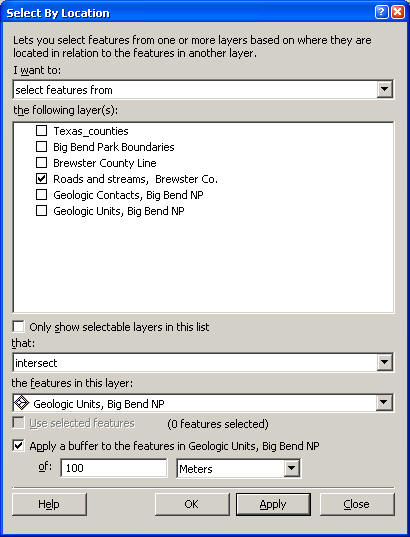
- From the Selection menu, choose "Select by Location" to
bring up the lovely "Select by Location" window (shown below).
|
|
- Our objective is to select streams that intersect Intrusive rocks,
which we will modify to include streams that are within 100 meters of
Intrusive rocks. Flll out the "Select By Location" window
so it looks like the adjacent graphic. Apply the selection.
The resulting selection contains the previously selected Intrusive
rocks, as well as the desired streams. Also selected are other
features within the Roads and streams layer, such as roads, highways and
any other line features that intersect or are within 100 meters of
Intrusive rocks.
- To remove these other features and the Intrusive rocks from
the selection, go back to the Selection menu and "Select by Attribute",
setting the Layer to Geologic Units, the Method to "REMOVE FROM
CURRENT SELECTION" and a query that is the same as previously used:
"FORMATION" = ' Intrusive rock'
Applying this selection will remove the Intrusive rocks from the
selection, leaving just features in the Roads and streams layer. We
now need to clean this up to remove everything but the streams.
- Open the attribute table for the Roads and streams layer.
- Change the display to show only the 185 Selected Records (bottom of
the window, Show "Selected" rather than "All"). Examine the fields
in this table. The last field in the table, FEATURE_GENERAL will
be useful for removing all but the records that have the attribute
"Water". Do nothing else to this table, simply close it.
- If not still open, Bring up the Select by Attribute window again.
This time we wish to remove all lines in the Roads and Streams
layer that do not have the attribute of "Water" in the FEATURE_GENERAL
field. Set the Layer to Roads and streams, leave the Method
at "Remove from current selection" and build the expression: "FEATURE_GENERAL"
<> 'Water'. The <> symbols means "not equal to", so the expression
will remove from the currently selected features those features within
Roads and streams that have FEATURE_GENERAL values not equal
to water.
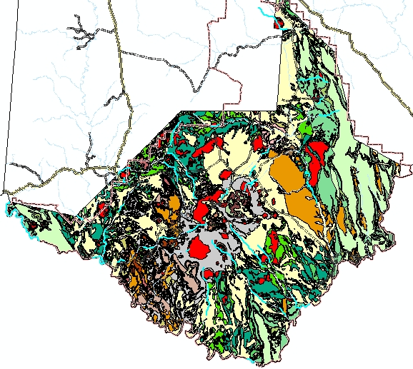
- Apply the query to see a map (below) that now shows a selection of only the
streams that intersect or are within 100 meters of Intrusive rocks (see
below)! WAY COOL!
- Export these intersecting streams to a new shapefile using the
procedure given near the beginning of this section.
|
|
4.43 Map to turn in:
Make a layout of the park showing showing only: 1) the park boundaries, 2)
the intrusive rocks (in red) 3) the streams that intersect intrusive
rocks, 4) all other streams within the park. The latter will require
a new shapefile produced by another "Select by Location" combined
with a "Select by Attribute" that uses the Park boundary and the Roads and
streams layers. Symbolize the two sets of streams differently,
include labels where need. Also include a lat./lon. graticule, a
scale bar, north arrow, title and your name and date. |
|
| |
|
| 4.44 Selecting with the "Select Features" Tool This
last selection technique is among the simplest but perhaps the
least discriminating. The "Select Features" tool
 on the Tools toolbar can be used to interactively select features
from the display. It operates only on layers that are
available for selection. A layer is made available or
unavailable for selection by going once again to the Selection
menu, choosing "Set Selectable Layers..." and checking on or off
the desired layers. The Set Selectable Layers... dialog box
is shown below, with only the Roads and streams layer checked on
for selection.
on the Tools toolbar can be used to interactively select features
from the display. It operates only on layers that are
available for selection. A layer is made available or
unavailable for selection by going once again to the Selection
menu, choosing "Set Selectable Layers..." and checking on or off
the desired layers. The Set Selectable Layers... dialog box
is shown below, with only the Roads and streams layer checked on
for selection.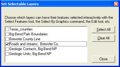
- The most common mistake in using the Select Features tools
is forgetting to set the selectable layers, yielding the
frustrating result of not being able to select what you want, or
getting a lot more than you intended.
- Experiment with this tool and with setting the selectable layers
to see how selective you can be.
|
|
You're Done! |
|
|